
AminoChain Empty States
AminoChain streamlines biosample procurement, safeguards data, and accelerates ethical breakthroughs in healthcare. Our primary application, the Specimen Center, serves as an e-marketplace for biosamples, hosting over 400,000 specimens from reputable biobanks worldwide. Through the Specimen Center, researchers can send inquiries to biobanks to procure the samples they need for research.
I designed empty states for the Specimen Center.
Role
Product Design
Timeline
2 months | April - May '25
Team
1 designer
Problem
Empty states on the Specimen Center lacked clear direction, leaving users uncertain about what to do next. Without meaningful feedback or guidance, these moments of "nothingness" risked feeling like dead ends, creating confusion and drop-off at critical points in the user journey.
Outcome
I transformed empty states into intentional guidance moments by designing animations and contextual CTAs that helped users understand their situation and take clear next steps. By defining use cases for each state and collaborating with engineering on feasibility, I shipped 4 of 8 states — including the empty cart, no sample, connectivity issues, and loading states.
Problem #1
Users aren’t incentivized to add samples to their cart on the SC
Standard UX practices involve designing empty cart states with actionable CTAs to motivate users to browse products and add items to their cart. What currently exists as the empty cart state on the inquiries page of the Specimen Center is a blank space. Users are thus less likely to add samples to their cart unless an empty state is designed for it.
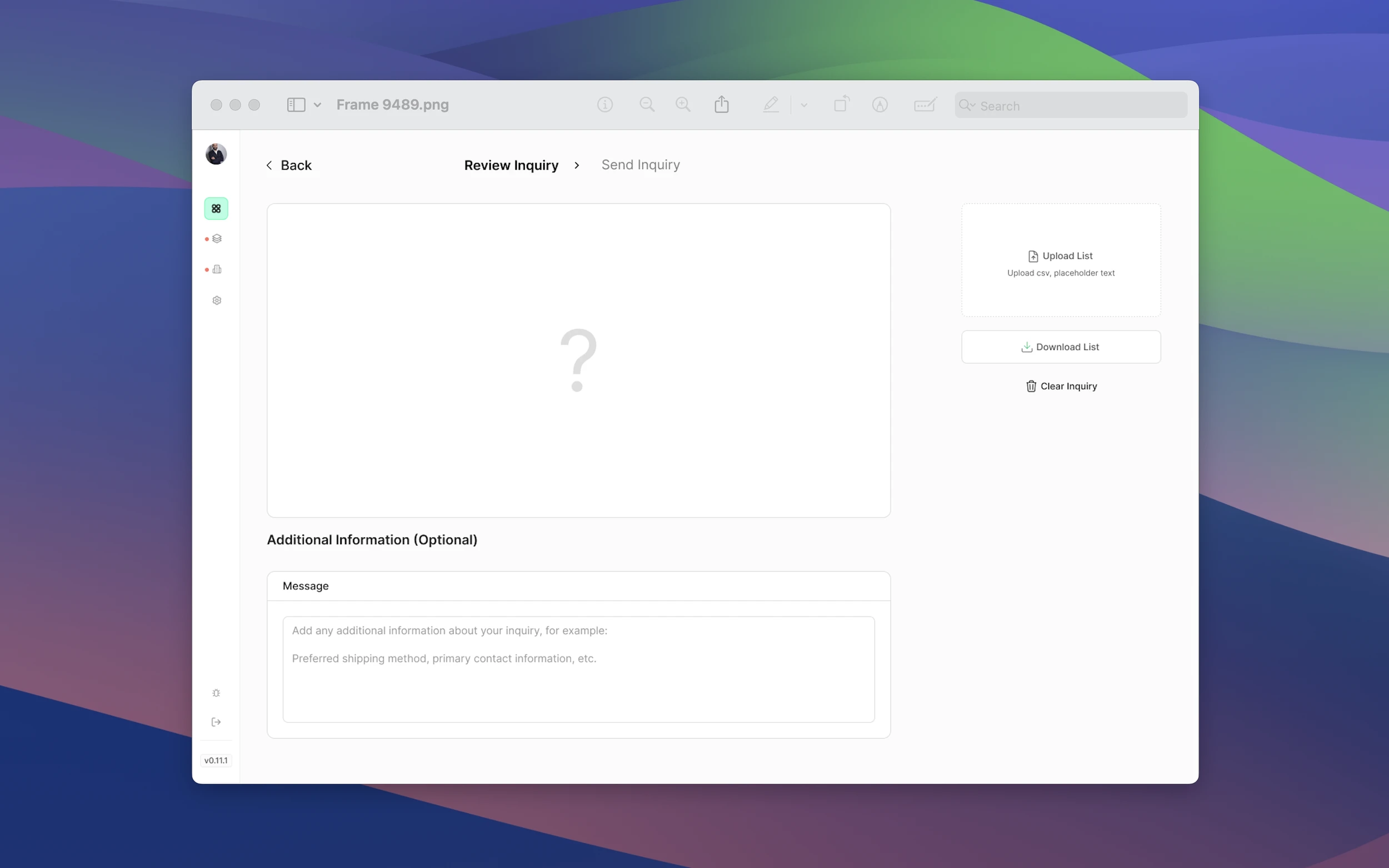
State #1
an empty cart state
I created an empty test tube rack animation that accompanies an “Add to Inquiry” call-to-action that, when clicked, guides users back to the Specimen Center table. See it here.


Problem #2
Users don’t know when the Specimen Center is processing a search request
Standard UX practices involve designing loading states that display useful information to indicate when content is being loaded, prevent user frustration, and maintain engagement during wait times. When a user searches for a sample on the SC, they don’t see a loading state.
State #2
a loading state
I created a loading animation that accompanies phrases like “Clearing search” and “Updating filters” to communicate to users that their search is being processed. To see it, try searching on the SC here.


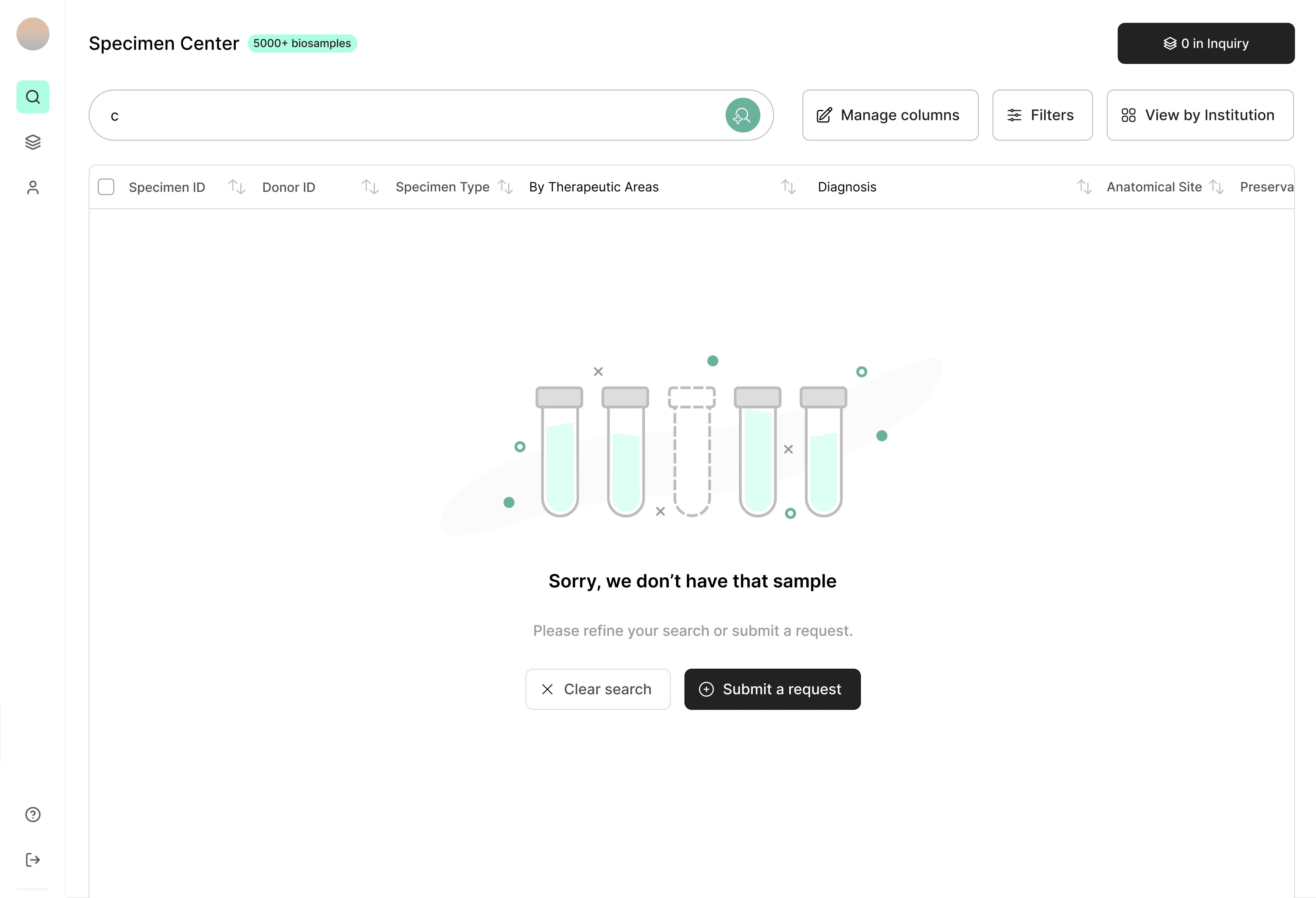
Problem #3
Users don’t know when their search results yield no results
When a user searches for a sample on the SC that yields no results, they aren't provided with steps that can either help them find an alternative or communicate with biobanks to see if they might have it in the future.
State #3
a no sample found state
I created no sample found animation that provides two CTAs to a) clear their search or b) submit an inquiry to a biobank to communicate to users that if the Specimen Center doesn't have their sample, then there are alternate routes they can take to acquire that sample. To see it, try searching on the SC here.

Defining use cases
for all empty states
I created a design brief that defined all the use cases for each empty state, whether used or unused, to make discussions and handoffs with the engineering team easy.
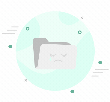
Unused "no file found" state

Designing and prototyping
from scratch
These animations were designed and prototyped from scratch in Figma, all on one page. Once each frame was created, I uploaded them through LottieFiles and exported them as .json or dotLottie files, depending on the request of the engineers. This process took around 40 hours, minus meeting hours.
